Hi ActivityInfo team,
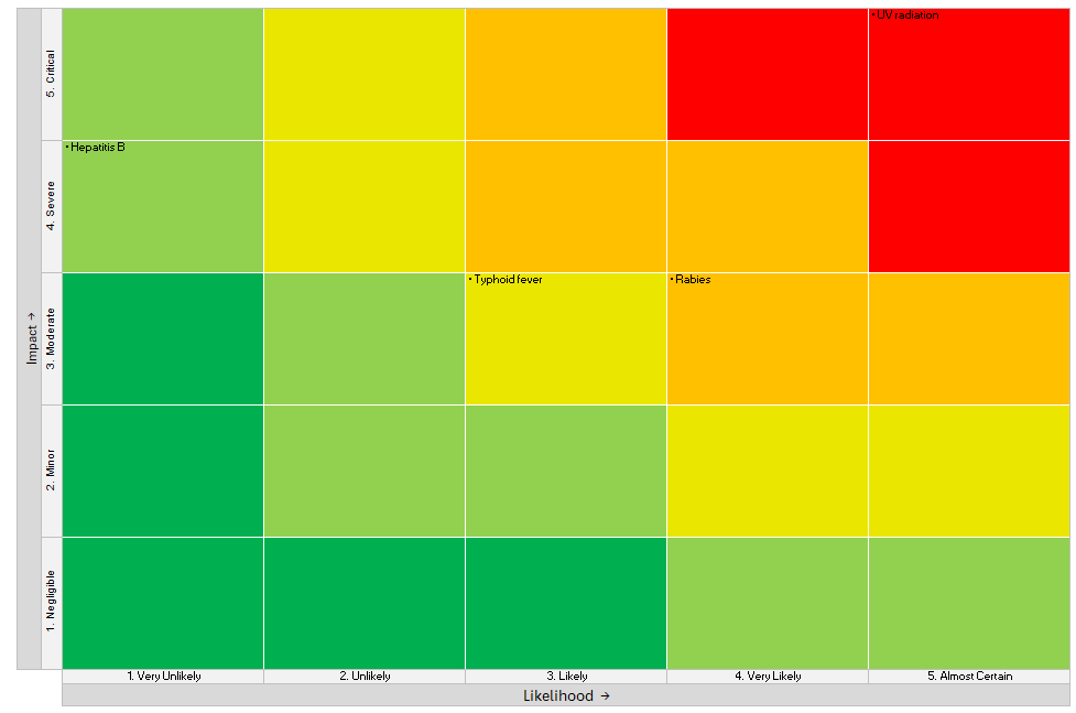
It would be very helpful to have a Risk Matrix chart type (e.g., 3×3, 4×4, 5×5) that plots risks by Likelihood and Impact, with color-coded severity zones. This is widely used in risk assessments and project/program management.
Key needs:
-
Configurable axes: labels and scales for Likelihood and Impact
-
Color zones (green/amber/red) by severity
-
Optional threshold lines and categories
-
Ability to plot multiple risks with labels/tooltips
-
Filter by partner, location, project, date
-
Export to image/PDF for reports
This would make it much easier to communicate risk profiles within ActivityInfo dashboards and reports.
Thanks for considering!
All the best,
Elamein